
Leg Work Studio
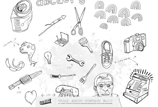
The website is full of sketched elements that are actually clickable, and help to navigate the users to all of the relevant content.
This is not a conventional black and white website. The designer has put loads of creativity and imagination into this site.
A very interactive web design that uses lots of bold typography throughout the site. Mouse over effect is great.
The website only contains black and white colors which puts the emphasis on the key ingredients of the design and grabs the attention on the first look.
White color font is used against black background that looks awesomely appealing. The images used also add a visual interest to the overall look.
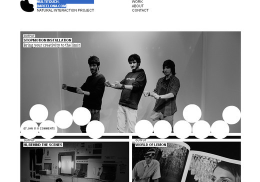
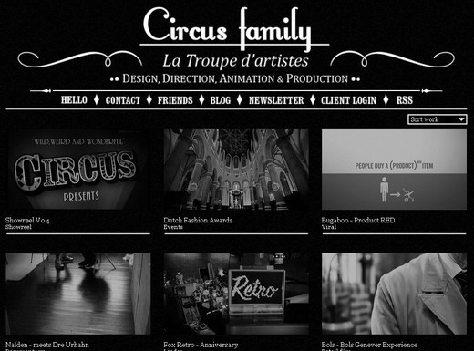
A black and white website design that is created on the concept of minimalism. Simple and effective.

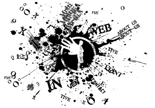
A very unusual design concept that sets this website apart from others. Special attention is given to the graphics used that is truly inspirational.
The hover effect on this website is simply marvelous that even makes you forget the absence of colors.
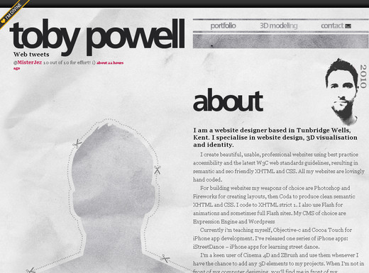
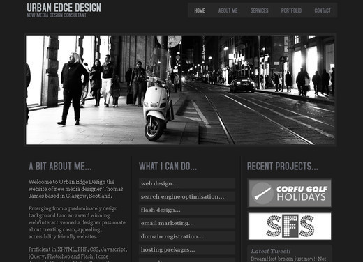
This is not a pure black and white website design rather the mixture of white and grey color to give the design a much more subtle look.
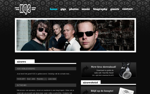
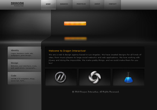
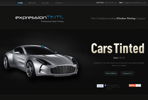
Here the designer brilliantly uses the black and white to set off the touch of light blue color which adds a nice spark.
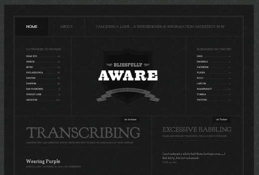
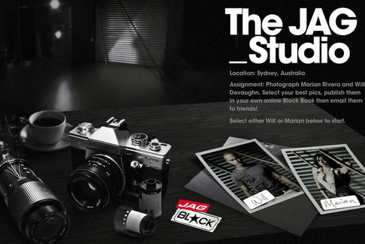
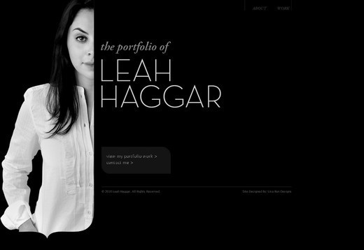
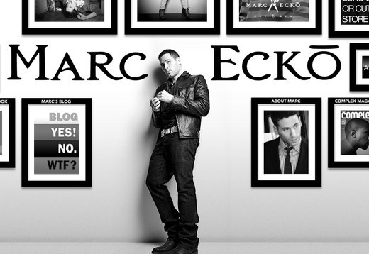
A pure classic black and white website design using an emotive and beautiful black and white photograph to set off the introduction to the site.
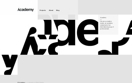
Excellent use of typography that is the main attraction of this web design. Apart from the typography, the layout of this web design also adds beauty to the overall concept.

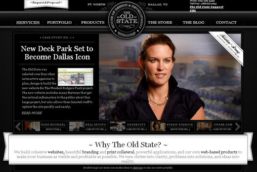
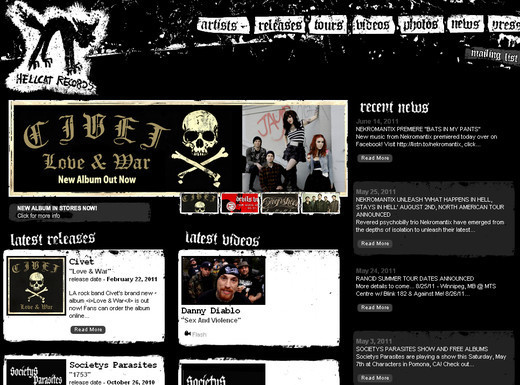
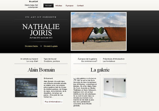
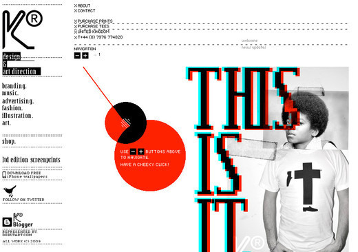
You will find a bit of color variation in this web design, with splashes of red thrown in here and there, but overall the site sticks to the use of black and white.
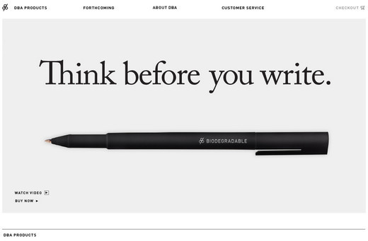
In this web design the main color that was used is white. Clear and bold black typography is used against the white background which stands out brilliantly.
This is one of the simplest yet most appealing and effective black and white website designs featured. The precision and neatness is the main attraction for this web design.
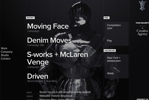
This particular design of black and white website is a milestone that inspires loads of designers to create something out of the ordinary.
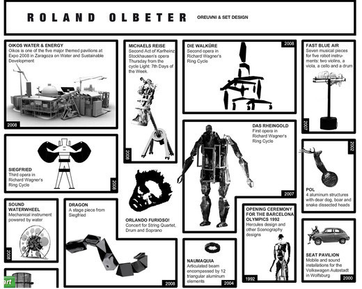
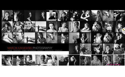
So many images are incorporated within the design yet look so appealing even without the colors. This website design proves that colors are not necessarily required to showcase your creativity.
A very neat and clean black and white website design that not only captures the attention of the onlookers but also displays the information in the cleanest of ways.
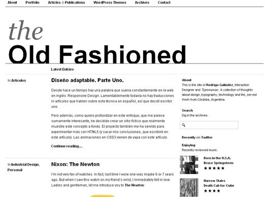
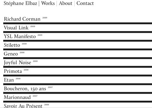
A simple and minimalist website design that although does not showcase loads of graphical elements, the presentation of text and the typography make this website compelling.
This website design comes with an interactive header. Although the website main colors are black and white, the hover effect brings a very beautiful blue shade to the design.
A very neat and clean website with a white background and minimal graphical element to put emphasis on the content of the site.
A very unusual website design that mainly focuses on the products the website offers, and uses the design to help place this emphasis.
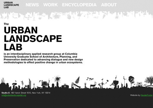
A black and white website that is designed on the concept of minimalism having a single insignia as the only graphical element.
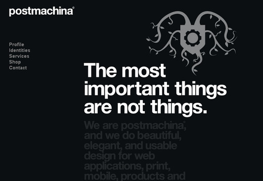
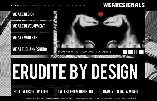
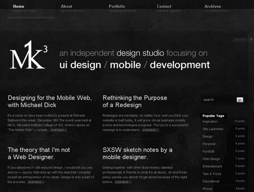
Another beautiful example that proves creativity has no limit. Appealing typography is used against the black background.
This website has created its own style. The only clickable area is the upper left corner of the website while the rest of the web page does not contain any element or content.

The website takes some time to load but once it is loaded completely, you can see how differently the artist has designed it making the site stand out from the rest.
This web design is full of interactive and creative elements. Click on the element you wish to browse through and experience a whole new world of creativeness.
The main area of focus is their projects that they completed with flying colors. The background of the website changes every time you visit.
Main emphasis is on the graphics and visual representation of the web elements. You will not only enjoy browsing through the website but will also be amazed to see the creative approach of the designer.
Adobe Flash is required to view this website properly. Extremely awesome graphics are used here that grabs the attention.
Images and graphics will appear as you move your mouse with the arrows present at the corner of the website. The main area of the web page is occupied with the text links.

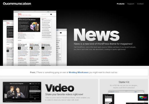
This website is divided into two colors; the upper half has white background with black text links and the lower half has the black ground with white text links and interactive graphics.

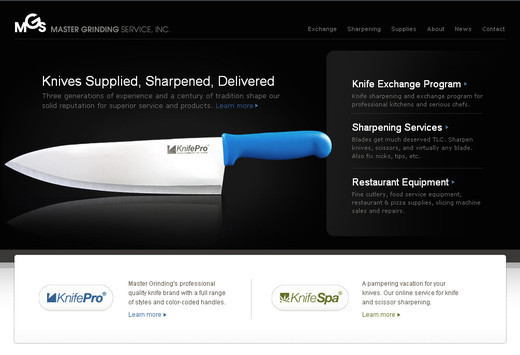
The pure white background is the most appealing element of this web design. Neat and clean web design.
The website is designed with two colors in such a way that you do not even realize that there is no other color present in the web design.
A very elegant web design that not only appeals to your eyes but also gives you a soothing feeling.
Again, this site has a very unusual use of the hover effect. No clichés and clutter elements, only the necessary elements are placed here.
A very unique navigation style is employed on this bold, clean design, with light splashes of color thrown in for contrast.
Nenhum comentário:
Postar um comentário